
One of the best ways to elicit desired emotions and reactions from your film audience is through the use of color. In horror movies, color grading has helped creators set the right mood or ad symbolism to a scene. The only horror that doesn’t need any colors is students’ homework. Custom dissertation writing services seem to be the only light in the endless tunnel of assignments. In this article, we look at the most used colors in horror films -red, orange, and yellow- and the films that used these colors with great effect.
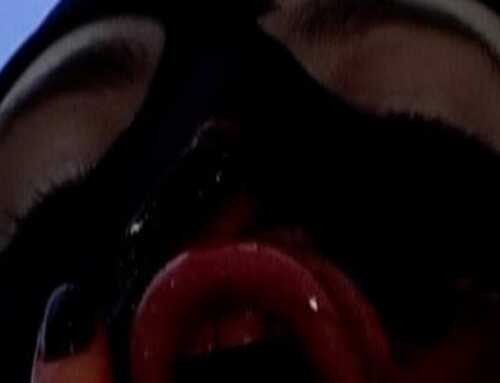
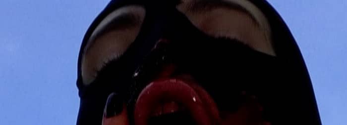
Red: Suspiria
One of the most iconic horror films with great color palettes, the 1977 horror classic Suspiria uses vivid primary colors. This is counterintuitive but genius at the same time. Because we perceive these colors as familiar, director Dario Argento brings the horror very close to the viewer. Argento integrates color deliberately into his scenes to amplify unease and violence. The omnipresent intense red walls of the ballet school accentuate the violence that takes place within these walls. The red walls also make the transition to other scenes and moods even more striking. Throughout the film, Argento moves from the violent red hallway to the freezing blue attic and outdoor scenes. The effect on the viewer is palpable, demonstrating Argento’s mastery in stirring emotions.
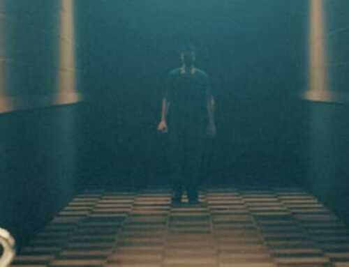
Orange: Beyond the Black Rainbow
Horror director Panos Cosmatos has made orange one of the main themes in his 2010 sci-fi horror movie Beyond the Black Rainbow. The movie tells the story of a woman who’s trying to escape the enigmatic Arboria institute. To create a ‘70s-style futuristic design, Cosmatos infused vibrant orange in his scenes, from the institute floors (reminiscent of Argento’s use of red walls) to the orange jumpsuits and masks of the sentionauts. The antagonist, Dr. Mercurio Arboria, bathes in a forewarning orange light, which accentuates the contrast with the teal color that accompanies the main character, Elena. Teal and orange were also a popular contrasting color choice in films in the 2010s.
Orange is said to represent emotional balance, freedom, and warmth. Others suggest that orange may indicate a lack of serious intellectual values and trigger anxiety. This psychology of the color orange might also have influenced Cosmatos’ artistic choices for his movie.
Yellow: Honeydew
For his 2020 movie Honeydew, director Devereux Milburn, made yellow a theme. From the title to the set colors, actor clothing, and lighting, everything in this movie is bathing in amber tones. The yellow theme could be the director’s wink at the distributor of the film, Yellow Veil Pictures. The yellow color highlights the initial warm welcome of a homey house in the woods that turns sinister. A tried and tested horror formula.
Dichotomy or the creation of contrast through the representation of two opposed things is often applied in the horror genre to create unease and blur the lines between familiar and evil. Milburn did so masterfully in this backwoods horror movie.
These are only three examples of the horror genre’s true artistry of color. Now you can appreciate the genre on a whole new level and notice the use of green in Saw or The Ring, red in The Shining, or blue in so many other horror flicks.


